Box and whisker plots
A post regarding challenges to completing box and whisker plots (and a Desmos activity to try at the end)
Viv
6/30/20235 min read

Box and Whisker plots
I've taught three different probability and statistics classes in my career (high school and for undergraduates). Four years of one course, three semesters of another, and two semesters of the third. One thing I've gleaned from teaching these courses is that students often expect prescriptive actions to solve problems. Take the box and whisker plot, for example. First, let's establish what we know about box and whisker plots. There is a five number summary: minimum, maximum, and three quartiles (okay, one of the quartiles is the median). The minimum (we could also identify this as the 0th percentile) and maximum (the 100th percentile), pretty clear what those are (the smallest and largest data values), but what about the quartiles? Quartile 1 (the 25th percentile), quartile 2 (the median or the 50th percentile), and quartile 3 (the 75th percentile), what do those mean? Wikipedia tells us that
"percentiles are a type of quantiles (sic), obtained adopting a subdivision into 100 groups. The 25th percentile is also known as the first quartile (Q1), the 50th percentile as the median or second quartile (Q2), and the 75th percentile as the third quartile (Q3). For example, the 50th percentile (median) is the score below (or at or below, depending on the definition) which 50% of the scores in the distribution are found" (https://en.wikipedia.org/wiki/Percentile accessed on 6/29/2023).
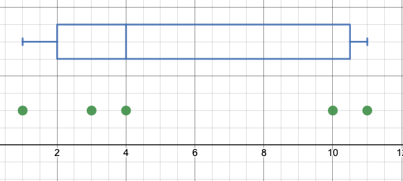
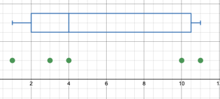
What is key here and creates a challenge for identifying procedural steps for creating box and whisker plots is when the above quote says, "depending on the definition." For large datasets, the differences in definitions is negligible and whether you include or exclude the datum associated with the percentile or not typically does not have a large impact. However, for very small datasets (and possibly for high-stakes standardized tests... it does matter). If I have a dataset of five values, say: {1, 3, 4, 10, 11} see the dotplot and box and whisker plot I created on Desmos' calculator below. Whether below or at, the datum 4 does not represent the "below" 50th percentile as described in Wikipedia. We can do one of two things to fix our dilemma. First, we can redefine the 50th percentile to indicate the point where 50% of the data lie above and below that point (and ignore the point on that line momentarily). The second option is to be flexible with these numbers and say something like, "the 50th percentile is the point where approximately 50% of the data lie below (or at, however you want to define it, really!)." The Common Core (https://learning.ccsso.org/wp-content/uploads/2022/11/Math_Standards1.pdf#%5B%7B%22num%22%3A55%2C%22gen%22%3A0%7D%2C%7B%22name%22%3A%22FitR%22%7D%2C-6%2C41%2C617%2C795%5D accessed 7/4/2023) addresses this in teeny-tiny print (most people call it a foot-note) and says of the first quartile, "many different methods for computing quartiles are in use. The method defined here is sometimes called the Moore and McCabe method" (p. 85). This suggests that there is a name for the way the Common Core intents students to find the quartiles, AND that there are multiple ways to do it (these other ways also might have names).
A quick google search brought me to a page entitled "Mathematics Monster" (https://www.mathematics-monster.com/lessons/methods_for_finding_the_quartiles.html, accessed on 7/4/2023) provides a variety of methods including: Moore and McCabe (M&M), Tukey, Mendenhall and Sincich (M&S). In brief, for a set of data with an odd number of items, M&M find the first quartile by ignoring the identified median value, Tukey includes the median value, and M&S takes the number of data items adds one divides by four and counts up to whatever the (n+1)/4 th data item is for each quartile. For the odd data items example used one the Mathematical Monster website, M&M, and M&S have identical first quartile values. This makes me wonder which of these three methods match up for different data sets, if M&M and M&S are always the same, why do we have two distinct methods (other than the process is slightly different). So it turns out that they are not always the same. I started my exploration with the set (1,2,3,4,5,6,7) and found that M&M and M&S were the same and Tukey was different (I'll leave it to the reader to figure that one out). The next set was (1,2,3,4,5,6,7,8,9) and this is where additional information about M&S comes in. Because to find the quartiles we calculate (9+1)/4= 2.5 but the first quartile isn't the 2 and a half-th data point, it is rounded down, and this means that M&M and M&S have different quartiles (whew, if they were always the same, I think I'd have a breakdown). I think M&M method more closely creates the situations where the data is broken into equal groups (if we are willing to ignore the median value)
Why does this matter? Again, for large data sets, it shouldn't matter much, and won't matter at all if one is transparent about the method they used (see the three methods above). But students do not get that chance on standardized tests, they are relegated to whichever method the test writers expect. And this goes against the Common Core design in some ways.
So one thing I wonder about is how do we convey to students that there are multiple ways to partition a dataset for a box and whisker plot, but they will be expected to use the Moore and McCabe method (maybe, I'm still not sure if the test writers are using this same method... I believe Tukey is quite popular with statisticians)? I ask this because I think it is essential that students have the opportunity to make judgements about the data they are analyzing and it is horribly limiting to say, "Moore and McCabe is the ONLY way to find the quartiles for box and whisker plots" and doing so continues to enforce the idea that math is just a set of rules you learn, not something you can explore and own. The easiest way that I can think of to navigate this dilemma is to always use an even number of data points, this minimizes the differences (though does not eradicate them entirely), but this too seems disingenuous.
I have created a Desmos task for students to explore box plots a bit, though it still does not address the challenge I asked about with regards to M&M, Tukey, and M&S. I think it provides students an opportunity to explore box plots as Desmos creates them, and then there can be a conversation as a class about how to formally do it (for the exam or real world, or whatever).
https://teacher.desmos.com/activitybuilder/custom/649ed3e3d0be06de8a72a9c3